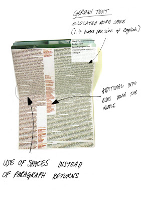
Above is a double page spread from a catalogue (designed by North) for an exhibition of the work of Marc Quinn held at the Kunstverein Hannover Gallery in Germany.
The really unique thing about this catalogue is the use of layout. The copy is set across the double page and is separated into two seemingly random sections. The information is presented in both English (left column) and German (right). The underlying structure of the page is an eight-column vertical grid, the right copy has been allowed more space as typically a German line of text is 1.4 times the size of English.
The Bibliography and any additional text is placed between the two main columns in red to create a nice visual divide. The thing I really like about this layout is that rather than using paragraph returns the designers have used spacing creating irregular gaps in the body of text. Usually gaps like this would be avoided at all costs but it works when the copy is dense like it is in this example.
The only criticism I would have of this layout is that a person with visual imparements would struggle to read the copy on many levels. The copy is too dense (not enough leading between lines), andd the lack of paragraphing makes it easy to lose track - In other words the lack of order means that things that should start in the same place, like the beginning of a paragraph, don't match up.

No comments:
Post a Comment