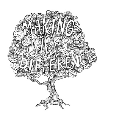
Below is my own illustration work loosely influenced by the work of James Joyce. The message 'making a difference' within the tree is refering to a recent tree-planting initiative set-up in my local area by the City council and I wanted to try and raise the profile of the event with the illustration.
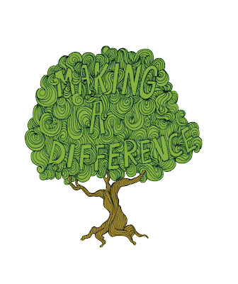
I have also tried the same image with colour, please let me know what you think.
 I have also tried the same image with colour, please let me know what you think.

3 comments:
I think that the colours you have chosen work well and give a very earthy feel to the design, however the writing becomes more difficult to read when its on the coloured design, maybe try changing the shade of the writing slightly?
At the moment the black and white is probably my favourite, and would be easy to produce and put on various backgrounds.
Thanks for the comments, i will definately give it a go, I do kind of like the way the text gets hidden slightly; this would work if the tag-line was present somewhere else (like the magazine spread) but as a stand-alone image I feel you are right about the readability.
Post a Comment