Below is a new self-initiated project I have been working on for Leeds-based rock band Relapse. The following images dhow the new band identity and two experimental promo posters
Band Identity: This new identity has taken influence from the 'nu-wave' type style where letterforms take on more symplistic geometric shapes. I decided to watercolour the type rather than digitally producing them to create something new and slightly less structured in aesthetic value (to represent the nature of the band).
Promotional posters:
Here are two promotional posters experimenting with the layout of the band identity as well as the inclusion of my own illustration taking influence from the music of the band as well as the work of Alphonse Mucha.
My response to the brief is a short film experimenting with visual representation of thought processes. The subject of the film is a conversation between two people with a previous history that affects the way they now perceive each other on a conscious level. The style of the film is influenced by my research into the work of Michel Gondry and music video director Ace Norton. The visual representation of thoughts reveal the characters’ true emotions through words, colour and symbols. One of the most easily recognizable symbols of thought is the ‘thought bubble’ made popular by the representation of interior monologues in comic book artwork. For this reason, I developed a visual style heavily relying on the depiction of the monologue rather than the commonly used voice-over. I elected not to focus on the dialogue between characters in order to emphasize the things that would not usually be seen in film-based media.
The advantage of focusing on thoughts over words is that the narrative is not hidebound by the social niceties of day-to-day interactions. The characters are free to express their real feelings and motivations and in turn the audience is liberated to comprehend the realities of complex social situations. In addition, an interaction which would have otherwise been mundane becomes visually stimulating as the invisible becomes visible.
Finally, I have tried to push the concept of visual thoughts further to suggest that if thoughts can somehow leave the safety of the thought bubble they then become a physical entity, now visible to the characters, which in turn demands action.
Below is some of my own personal work stemming from the icount illustration by James Joyce. This is an idea to create a magazine spread for my local area, the purpose being to infrom an audience of the developments in their locality without throwing stats at them. I have treid to create as much space as possible and really draw attention to the illustration which is very much part of the developments that will be raised in the spread (once it is complete!). Please let me know what you think...
Below is my own illustration work loosely influenced by the work of James Joyce. The message 'making a difference' within the tree is refering to a recent tree-planting initiative set-up in my local area by the City council and I wanted to try and raise the profile of the event with the illustration.I have also tried the same image with colour, please let me know what you think.
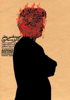
Since my travels to Damascus last year I have become very interested in Graphic Design and the development of Design in the Middle East. Alot of the design produced by Arabic speaking countries is based heavily around typogrpahy as Arabic is a beautiful language with alot of elegant contours that work well on posters.
I was delighted to find work from the East that I haven't seen before on Anna Stratigaks' Blog today. The work of Reza Abedini is really interesting becuase it combines arabic typography with illustration to produce Graphic Art, this was something I have been experimenting with and my illustrtation for D&AD New Blood was probably the most successful example of this: This was a combination of my father's Arabic (handwritten) and my illustration influenced by Middle Estern Photojournalism.
Below are some example's of Abedini's Graphic Art:
I love the juxtaposition of the elegant contours of the Arabic typography with the almost 'urban' imagery and English Caps.
After looking at the Design team's blog I decided to enter Tigerprint's web-based wrapping paper competition. Tigerprint were after something unusual and creative so I used some of my pattern work from last year to create a floral influenced theme with a retro feel to it.