Showing posts with label Illustration. Show all posts

Sunday, 23 March 2008

Band Identity development

Below is a new self-initiated project I have been working on for Leeds-based rock band Relapse. The following images dhow the new band identity and two experimental promo posters


Band Identity:
This new identity has taken influence from the 'nu-wave' type style where letterforms take on more symplistic geometric shapes. I decided to watercolour the type rather than digitally producing them to create something new and slightly less structured in aesthetic value (to represent the nature of the band).

Promotional posters:


Here are two promotional posters experimenting with the layout of the band identity as well as the inclusion of my own illustration taking influence from the music of the band as well as the work of Alphonse Mucha.

Please let me know what you think...

Sunday, 19 August 2007

The Saga of Noggin The Nog: Tales of the Northlands

I remember watching this as a kid on VHS and loving the simple two dimensional animation, illustrated stills and the total dependence on narration to deliver each episode. I really admired the beautiful drawings and the sketchy stop motion animation that brought the stills to life. Enjoy!

Saturday, 18 August 2007

Alberto Seveso


After looking at the work of Neil Deurden I found a Blog of Michelle Almond's about Alberto Seveso's work. It is really similar to Deurden's illustrative work but takes it one step further by allowing the illustration to flow and dictate what parts of the female figure are revealed and what parts are left forthe imagination to 'draw'.

What I love about the above images is the way the illustrative shapes curve and mimic the shape of the human form and almost latch around the features of the model's face. The work creates a very delicate and femenine feel but at the same time images like the first one can still suggest a vibrance and playfulness which I admire and would lend itself well to animation.

Neil Duerden - Ingulf


Above are a collection of fashion pieces named 'Ingulf' by Neil Duerden combining photography and illustration. What I like about these images is that the illustration has been overlayed onto the skin of the model, her body becomes the canvas and the contours created by her body in turn define the shape of the illustration. This is in contrast to alot of design using photography and illustration where the photograph is left unchanged and the illustration either floats on top or in the background.

However, it would be nice to see how this image would look if the illustration were painted directly onto the skin becuase although the illustration has been carefully placed around the limbs and contours of the model I can't help but think it may be more successful to do it for real

Thursday, 16 August 2007

Justice - 'D.A.N.C.E' dir. Jonas & Francois

This is a really nice video coming of the back of the recent 'new rave' fashion trend. The video shows T-shirt graphics animated onto two models as they walk towards and away from the camera. I especially like the fact that some of the animation has been timed to make it look as if the models are interacting with the T-shirt designs. I also like the fact that the focus of the camera is on the torso of the model and completely crops out the head of the model (making you focus on the T-shirts before anything else).

Thursday, 19 July 2007

Magazine Spread - Personal Work

Below is some of my own personal work stemming from the icount illustration by James Joyce. This is an idea to create a magazine spread for my local area, the purpose being to infrom an audience of the developments in their locality without throwing stats at them. I have treid to create as much space as possible and really draw attention to the illustration which is very much part of the developments that will be raised in the spread (once it is complete!). Please let me know what you think...


My response to James Joyce Illustration

Below is my own illustration work loosely influenced by the work of James Joyce. The message 'making a difference' within the tree is refering to a recent tree-planting initiative set-up in my local area by the City council and I wanted to try and raise the profile of the event with the illustration.I have also tried the same image with colour, please let me know what you think.

James Joyce - icount Illustration

I was looking at the icount 'Stop Climate Change' book published by Penguin and I came across illustrations by James Joyce. I really like the use of line to create interesting visuals (from simple lines creating geometric shapes to elegant swirls creating trees and smoke). His drawings have the feel of children's illustration but are dealing with complex situations like climate change.

I feel that it is extremely appropriate to use a medium like illustration to get across a message as important as climate change. People might argue that this type of illustration is making-light of a serious situation but I feel that in order to inform an audience of ways to prevent drastic climate change without boring them then visual devices like illustration act as a way to do this.
For example, the illustration below carries a simple message about the environmental cost of vehicles. This illustation, to me, says more than a long-winded document about fuel-emissions.
I feel that design will have an important role in persuading people to change their current living habits and inspiring people to do something about a global issue. I don't mean to say that every designer needs to jump on the eco-bandwagon but good design and illustration (like the pieces above) can reach audiences who may be numb to facts and figures.

Saturday, 7 July 2007

D&AD Horror Film Festival Poster - Rick Banks

I was looking through some past issues of Computer Arts and I came across some work by Rick Banks (a recent graduate from Cumbria Institute of the Arts). I had a look at his site and found his D&AD entry for the Horror Film Festival poster. I really like his simple use of type and colour to create a confident and well-produced design.

I thought screenprinting was a good touch for this poster and I also thought that the glow-in-the-dark ink mask was a great addition to a good idea. It really enhanced the concept of the poster and also took advantage of the fact that when in a dark room (i.e. when the films are played at the festival) they will glow!


Check out his website for some other great work as well as pictures of his work process for these posters!

Thursday, 5 July 2007

Albatross Waltz - Simon Roswell Carter


Here is a one minute music promo developed for a track called 'Albatross Waltz' by Rafe Band. I really like the style of this animation, it is simple Illustrator and Photoshop layers set up in 3D space using Adobe After Effects. I really like the almost contemporary folk-tale look that has been used and the minimal application of colour really works.

The use of lighting in this animation is brilliant as well, it really shows off the depth of the animation and gives a subtle atmospheric touch. This animation has received alot of postive feedback and has won The Computer Arts Excellence Award in the recent Graduate Showcase in the July 2007 issue of the magazine.

Magnus Berg - Manatees CD Cover


This is a fantastic CD cover designed by Magnus Berg and featured in Computer Arts' Graduate Showcase 2007. This is a really good example of how good illustration and design can be enhanced by knowledge of printing techniques.

"This album cover was printed with a spot varnish and then foil-blocked in bronze. It shines!" - Magnus Berg

Tuesday, 3 July 2007

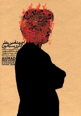
Graphic Design in the Middle East

Since my travels to Damascus last year I have become very interested in Graphic Design and the development of Design in the Middle East. Alot of the design produced by Arabic speaking countries is based heavily around typogrpahy as Arabic is a beautiful language with alot of elegant contours that work well on posters.

I was delighted to find work from the East that I haven't seen before on Anna Stratigaks' Blog today. The work of Reza Abedini is really interesting becuase it combines arabic typography with illustration to produce Graphic Art, this was something I have been experimenting with and my illustrtation for D&AD New Blood was probably the most successful example of this:
This was a combination of my father's Arabic (handwritten) and my illustration influenced by Middle Estern Photojournalism.

Below are some example's of Abedini's Graphic Art:


I love the juxtaposition of the elegant contours of the Arabic typography with the almost 'urban' imagery and English Caps.

'I Dress Myself' Promotional Package

I was looking on Creative Review's Blog today and I found a blog on D&AD New Blood. The Blog featured screen prints from Nick Saunders as well as some of his other work. I really liked the promo pack that he developed for screen-printing specialists 'I Dress Myself'. Below are some images of the promo pack, I feel that the design really captures the ethos of the company and has a very artistic and hand-made touch which is a popular trend in the professional design world at the moment.


Monday, 2 July 2007

Night of The Marabou - Gig poster


I really like this gig poster. It is a screenprinted poster for an electric night of bands and dj's held by The Evening Tweed design company. The artwork on the poster is by Sarah King.

I really like the splattered paint effect with the hand-rendered text cut out of the paint (through simple layering in Photoshop). The detail in the screenprint also shows the 'scratchy' and incomplete pain surface which is visually very interesting.

The typography is simple hand-rendered caps but works really well; I really like the use of scale to fit longer lines within the negative space created by the large copy.

Monday, 25 June 2007

Sarah King... continued.


Here is another exampleof some of Sarah King's work with illustration and scanned images. These three images were produced as invitations to The School of Historical and Critical Studies' Degree show.

I really like King's use of the basic typographic shapes but then turning it on its head by only filling the elements in part creating unusual geometric shapes that the eye then interprets as the letter in the searh of meaning.

Sarah King of Evening Tweed


I was browsing the Evening Tweed website when I found this image called 'Scanned and illustrated hands' by Sarah King. I really love the combination of illustration with actual hands, it is not too subtle but creates a really beautiful image.