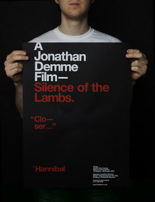
I was looking through some past issues of Computer Arts and I came across some work by Rick Banks (a recent graduate from Cumbria Institute of the Arts). I had a look at his site and found his D&AD entry for the Horror Film Festival poster. I really like his simple use of type and colour to create a confident and well-produced design.
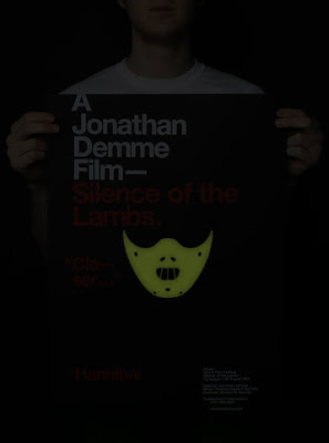
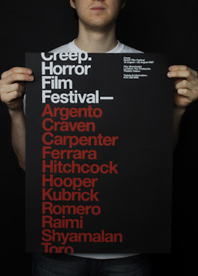 I thought screenprinting was a good touch for this poster and I also thought that the glow-in-the-dark ink mask was a great addition to a good idea. It really enhanced the concept of the poster and also took advantage of the fact that when in a dark room (i.e. when the films are played at the festival) they will glow!
 Check out his website for some other great work as well as pictures of his work process for these posters!
 I thought screenprinting was a good touch for this poster and I also thought that the glow-in-the-dark ink mask was a great addition to a good idea. It really enhanced the concept of the poster and also took advantage of the fact that when in a dark room (i.e. when the films are played at the festival) they will glow!
 Check out his website for some other great work as well as pictures of his work process for these posters!
1 comment:
This series of posters is great, shows how to simply adapt posters to create new outcomes with a twist. The one with the glow in the dark mask is a favourite, for many who have seen the film will recognise the mask instantly. But very simple and effective.
Post a Comment