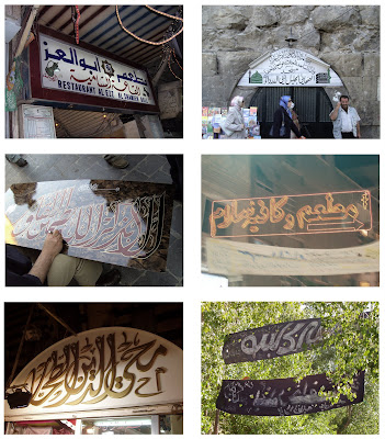
Below is a collection of images from my travels to Damascus, Syria. I have selected these images becuase they show the use of Arabic typography/ calligraphy in a real-life scenario working to inform as well as embellish.  I found alot of similarities between Eastern and Western use of typography. Alot of typography was used to inform (this is logical as it is a simple method of communication). One thing I did find was tht calligraphy was alot more dominant in the Eastern culture, with traditional calligraphers selling their work on the street - each piece being a detailed visual presentation of the Arabic language. Shop Fronts seemed to use calligraphy in different ways; the amount that the signage was embellished or decorated seemed to be a good indicator of the stsus of the shop (with the more traditional and up-market shops selling cloth and antiques having extremely embellished shop signage). I also noticed that the more modern shops in the city centre were using LED lighting and neon instead of embellishment - the Arabic would be more minimal but woud be backlit to create a modern look.
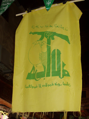
I also found Hezbollah flags hanging from the ceiling of the market halls. The flag uses different variations of Arabic to create a striking visual. According to Wikipedia the bottom of the Flag reads, "The Islamic Resistance in Lebanon." The upper text reads,"Then surely the party of Allah are they that shall be triumphant." (Quran 5:56) The main part of the Flag is the Hezbollah logo which is a representation of the phrase "Party of God" rendered inKufic script which I personally find the most bulky and masculine of all of the Arabic writing styles. The first letter of 'Allah' reaches up to grasp a rifle.
From a design point of view this logo communicates a very clear message even without having to understand the Arabic language, the use of the rifle and the clanched fist suggests violence, war and revolution. As stated earlier the Kufic script is also very masculine and has a very strong and confident 'tone-of-voice' which is also reflected in the boldness of colour and line.
 I found alot of similarities between Eastern and Western use of typography. Alot of typography was used to inform (this is logical as it is a simple method of communication). One thing I did find was tht calligraphy was alot more dominant in the Eastern culture, with traditional calligraphers selling their work on the street - each piece being a detailed visual presentation of the Arabic language. Shop Fronts seemed to use calligraphy in different ways; the amount that the signage was embellished or decorated seemed to be a good indicator of the stsus of the shop (with the more traditional and up-market shops selling cloth and antiques having extremely embellished shop signage). I also noticed that the more modern shops in the city centre were using LED lighting and neon instead of embellishment - the Arabic would be more minimal but woud be backlit to create a modern look.
I also found Hezbollah flags hanging from the ceiling of the market halls. The flag uses different variations of Arabic to create a striking visual. According to Wikipedia the bottom of the Flag reads, "The Islamic Resistance in Lebanon." The upper text reads,"Then surely the party of Allah are they that shall be triumphant." (Quran 5:56) The main part of the Flag is the Hezbollah logo which is a representation of the phrase "Party of God" rendered inKufic script which I personally find the most bulky and masculine of all of the Arabic writing styles. The first letter of 'Allah' reaches up to grasp a rifle.
From a design point of view this logo communicates a very clear message even without having to understand the Arabic language, the use of the rifle and the clanched fist suggests violence, war and revolution. As stated earlier the Kufic script is also very masculine and has a very strong and confident 'tone-of-voice' which is also reflected in the boldness of colour and line.


No comments:
Post a Comment