Showing posts with label Design. Show all posts

Sunday, 23 March 2008

Band Identity development

Below is a new self-initiated project I have been working on for Leeds-based rock band Relapse. The following images dhow the new band identity and two experimental promo posters


Band Identity:
This new identity has taken influence from the 'nu-wave' type style where letterforms take on more symplistic geometric shapes. I decided to watercolour the type rather than digitally producing them to create something new and slightly less structured in aesthetic value (to represent the nature of the band).

Promotional posters:


Here are two promotional posters experimenting with the layout of the band identity as well as the inclusion of my own illustration taking influence from the music of the band as well as the work of Alphonse Mucha.

Please let me know what you think...

Sunday, 2 September 2007

Pizza Express Menu


I went to Pizza Express this evening and was presented with the 'new look' menus. Initially all I saw was a blurry image of a couple on the front of a menu, no logo and the digital information of the photograph running down the side of the image. I was completley thrown, Pizza Express usually has highly illustrated covers to their menu and to be confronted with a holiday snap seemed to be completely unsuitable. However, I was wrong. When you open the menu the first thing you see is...


For me this blurb tied everything together and justified the holiday snapshot style of the front cover. The blurb reads '...Not the Rome from postcards, but the real Rome.' In context this suggests that the new pizzas and the new menu reflect a true glimpse of rome and doesn't sugarcoat or touch-up real life.

This is a really bold design and although I initially hated the fuzzy and cheesy images they really strengthen the concept. My only issue with some of the imagery is that while some look genuine, others look blatantly staged (which completley goes against the idea of reflecting the real Rome). Other than that this is a really strong concept.

Saturday, 1 September 2007

BBC Radio Scotland: Tartan Toyboys (1995)


I found this short motion piece using typographic imagery influenced by a radio conversation soundbites after looking at Callum Barker's Blog on Type in Motion. The motion piece was developed by Barnbook and can be fond on their website. The theme of the convesation is about male strippers (women talking about a strip show they are going to watch called The Tartan Toyboys). The visual style is heavily influenced by postitute cards found in telephone booths. The animation is cut to the conversation and is a collection of stills with elements of the conversation appearing in the chosen type styles creating a punchy aesthetic as well as suggesting an almost 'found' look to the images - taking typography out of context to link in with the soundtrack.

Saturday, 18 August 2007

Alberto Seveso


After looking at the work of Neil Deurden I found a Blog of Michelle Almond's about Alberto Seveso's work. It is really similar to Deurden's illustrative work but takes it one step further by allowing the illustration to flow and dictate what parts of the female figure are revealed and what parts are left forthe imagination to 'draw'.

What I love about the above images is the way the illustrative shapes curve and mimic the shape of the human form and almost latch around the features of the model's face. The work creates a very delicate and femenine feel but at the same time images like the first one can still suggest a vibrance and playfulness which I admire and would lend itself well to animation.

Neil Duerden - Ingulf


Above are a collection of fashion pieces named 'Ingulf' by Neil Duerden combining photography and illustration. What I like about these images is that the illustration has been overlayed onto the skin of the model, her body becomes the canvas and the contours created by her body in turn define the shape of the illustration. This is in contrast to alot of design using photography and illustration where the photograph is left unchanged and the illustration either floats on top or in the background.

However, it would be nice to see how this image would look if the illustration were painted directly onto the skin becuase although the illustration has been carefully placed around the limbs and contours of the model I can't help but think it may be more successful to do it for real

Saturday, 11 August 2007

Chester Subway Murals


Recently there has been a movement in my hometown to improve city elements like subways and try and lift some of the current stigma associated with them. Above are four murals developed by volunteers with input from some of the churches in Chester. The murals represent different elements of Chester i.e. The Roman and Victorian influences as well as showing some of the famous architectural elements of Chester like the Eastgate Clock and the Fountains Roundabout.

I really like the idea of using design like this to brighten up the area and improve elements of the urban environment. My only concern is that although the murals look fantastic they aren't that big in real life and don't really cover up enough of the subway walls, if the murals stretched across a full wall I think they could create an even bigger impact than they do already.

However, these murals are a vast improvement to Chester's subways and it is refreshing to see artwork being put into use in an urban environment (this is not a new thing but seems to often be forgotten about).

Cicatriz Website


Here is another interesting concept for an online clothing site. Cicatriz.se has a fully intergated flash shop telling you what is in stock as well as showcasing the latest product range in a series of low-res videos set up in a grid (above).

Although the videos are low-res there are some really nice little features. For example, on the second video of the top row the model has been filmed pretending to pull the logo off of his T-shirt, a heavily pixelated version of the logo is tracked into the blank space. The end result is a blatent awareness that the visual is not meant to be taken seriously but instead shows the quirky nature of the brand as well as emphasising a selling point of the garment. Another nice feature is the planning of the website. The films fit into a timeline meaning that the play in an order, this allows for more visual tricks (i.e. creating the illusion that an item of clothing is being past between videos on two different rows by filming dropping a garment in one video and receiving the same garment from above in the other video).

Friday, 10 August 2007

A rhythm of lines (website)


www.rhythmoflines.co.uk

As part of the 'rhythm of line campaign for the Audi A5 design company GT have developed a website where you can draw your own lines and create your own car shapes and then view them from various angles:
"We ask the audience to create their own rhythm of lines."
This is another example of how digital technology has advanced to allow the audience to have a new way to interact with the brand.

The Flaming Lips (Live)


When I was posting my blog about Peter Gabriel's live show it reminded me of a live perfomance by The Flaming Lips at last year's 02 Wireless Festival. At the beginning of the set the front-man (Wayne Coyne) stepped into a gaint inflatable ball and rolled over the crowd. It was completely surreal but it fantastic! I thought it was a really good way to communicate the nature of the band as well as creating something memorable, a shared event that all the people who were there could say they witnessed.

Peter Gabriel - Secret World Tour (1994)


Peter Gabriel (ex-genesis member, WOMAD and Realworld founder) has always been well known for his innovative work. The Secret World Tour in 1994 showed how a live tour could be about the theatrical as well as the music to compliment the themes and emotions a song may be trying to get across. Gabriel worked with Robert LePage to create a visionary style of theatre to accompany personal songs focused on relationships.


LePage and Gabriel looked at polarities as well as relationships. For example, synthetic and natural, love and hate, male and female etc. The stages developed for the show emulated the male and female polarities to create the structure below (bird's eye view):
The female stage uses a circle and the male a more geometric rectangle. The props also emulated the polarities; Gabriel emerges from the male stage in a red telephone box (which is arguably a masculine structure constructed from geometric shapes) and later in the show a tree emerges from the female stage (representing nature, mother earth, and in sharp contrast to the man-made phone box). This is a really well thought through tour concept which really showed the possibilities of a live show and set movements for more recent shows like OVO: The Millenium Dome show which was written by Gabriel. The videos above and below are just a glimpse of the tour but I strongly recommend watching the 'Secret World Live' DVD and also his more recent 2003 'Growing Up Tour' DVD.

Thursday, 19 July 2007

Magazine Spread - Personal Work

Below is some of my own personal work stemming from the icount illustration by James Joyce. This is an idea to create a magazine spread for my local area, the purpose being to infrom an audience of the developments in their locality without throwing stats at them. I have treid to create as much space as possible and really draw attention to the illustration which is very much part of the developments that will be raised in the spread (once it is complete!). Please let me know what you think...


Arabic Typography - Damascus, Syria

Below is a collection of images from my travels to Damascus, Syria. I have selected these images becuase they show the use of Arabic typography/ calligraphy in a real-life scenario working to inform as well as embellish. I found alot of similarities between Eastern and Western use of typography. Alot of typography was used to inform (this is logical as it is a simple method of communication). One thing I did find was tht calligraphy was alot more dominant in the Eastern culture, with traditional calligraphers selling their work on the street - each piece being a detailed visual presentation of the Arabic language. Shop Fronts seemed to use calligraphy in different ways; the amount that the signage was embellished or decorated seemed to be a good indicator of the stsus of the shop (with the more traditional and up-market shops selling cloth and antiques having extremely embellished shop signage). I also noticed that the more modern shops in the city centre were using LED lighting and neon instead of embellishment - the Arabic would be more minimal but woud be backlit to create a modern look.

I also found Hezbollah flags hanging from the ceiling of the market halls. The flag uses different variations of Arabic to create a striking visual. According to Wikipedia the bottom of the Flag reads, "The Islamic Resistance in Lebanon." The upper text reads,"Then surely the party of Allah are they that shall be triumphant." (Quran 5:56) The main part of the Flag is the Hezbollah logo which is a representation of the phrase "Party of God" rendered inKufic script which I personally find the most bulky and masculine of all of the Arabic writing styles. The first letter of 'Allah' reaches up to grasp a rifle.

From a design point of view this logo communicates a very clear message even without having to understand the Arabic language, the use of the rifle and the clanched fist suggests violence, war and revolution. As stated earlier the Kufic script is also very masculine and has a very strong and confident 'tone-of-voice' which is also reflected in the boldness of colour and line.

James Joyce - icount Illustration

I was looking at the icount 'Stop Climate Change' book published by Penguin and I came across illustrations by James Joyce. I really like the use of line to create interesting visuals (from simple lines creating geometric shapes to elegant swirls creating trees and smoke). His drawings have the feel of children's illustration but are dealing with complex situations like climate change.

I feel that it is extremely appropriate to use a medium like illustration to get across a message as important as climate change. People might argue that this type of illustration is making-light of a serious situation but I feel that in order to inform an audience of ways to prevent drastic climate change without boring them then visual devices like illustration act as a way to do this.
For example, the illustration below carries a simple message about the environmental cost of vehicles. This illustation, to me, says more than a long-winded document about fuel-emissions.
I feel that design will have an important role in persuading people to change their current living habits and inspiring people to do something about a global issue. I don't mean to say that every designer needs to jump on the eco-bandwagon but good design and illustration (like the pieces above) can reach audiences who may be numb to facts and figures.

Saturday, 14 July 2007

Environmentally Friendly Packaging

This week's issue of Design Week had a section about the new Daylesford Organic milk pouches. This form of packaging is made from a completely new material called Ecolean, a plastic made from 40% calcium carbonate (chalk) with polymers used only as a binding agent. This means that at the end of the lifecycle the calcium carbonate can be separated again and the binding agent turned into water vapour and carbon dioxide after complete dergradation i.e. after incineration.

This got me thinking about other forms of packaging. I am working part-time in retail at the moment and the amount of plastic and waste created by the store could surely be reduced. I was looking at ways this could be done and I saw Tom Dixon's polo designs for Lacoste.


The packaging was designed to show awareness of environmental issues. However, I feel this is more aesthetic than practical. When an item of clothing enters the store it is pre-packed in plastic, unpacked, sold and then put into a plastic bag to be taken away. This doesn't make sense. I understand that the pre-pack protects the clothing but surely there could be another way? Plastic bags are used in high street retail but what is the reason? image? to prevent water damage?

I was thinking what if the clothing was packaged in another way, perhaps in an aluminium can so that it is protected from damage and cuts out any need for plastic. All aluminium and steel cans are recyclable and can be recycled an infinite number of times without loss of essential properties. The can could then be placed in a paper bag that can be fully recycled.

Dizzee Rascal - 'Sirens' dir. W.I.Z.


After watching the short film 'Cubs' by Tom Harper I remembered seeing a recent video for Dizzee Rascal's 'Sirens'. The video follows a similar theme as 'Cubs' with Fox Hunting in an urban setting but what I liked about this music video was the use of symbolism. Fox Hunters riding through a housing estate creates a really interesting visual which seemingly has no relevance to the song until you realise that Dizzee Rascal is being hunted down like a fox. The Fox Hunters are a powerful metaphor for the police and authority and the way that some people feel that the police 'clamp down' on gangs and youth culture.


A really clever aspect of this video is the fur coat that Dizzee Rascal wears, it works as a symbol for youth and 'hoody' culture but also acts as a visual tool to represent the fox (at the end of the video the fur from the coat is drenched in blood and smeared over the youngest hunter in the pack as part of the ritual of the hunt).


The end of the video shows the young boy (presumably related to Dizzee) watching the 'kill' and ultimately becoming what one can only assume will be a trouble-maker. This suggests that although authority is put in place to stop crime it can sometimes develop or perpetuate crime.

Friday, 13 July 2007

Design for the Visually Impaired

"There are two million people with sight problems in the UK. Good design can make websites, information, products, services and buildings accessible to them."
RNIB Website (accessed 13th July 2007)

I have recently been doing some design-based work with my local council and have come across some real-life issues surrounding design and accessibility of information. Any document designed for the council needs to adhere to certain constraints in order to provent neglecting certain memebers of the public. For example, members of the public with visual impairements may have difficulty reading certain typefaces etc.

I found a list of a few design considerations that need to be thought about when designing for the the general public. These aren't strict rules but instead suggestions made by RNIB to maximize readability in design for print.

This is a real issue in design as nearly all of design is primarily about visual stimulus and it seems unusual to consider even thinking about design without this but making your work more accessible can be as simple as using a minimum pt size of 12.

Some of the guidelines I find difficult because they almost stifle creativity. The Marc Quinn Exhibition Catalogue by North Design uses a unique layout on some of its spreads where the breaks in text are spaces instead of paragraph returns. Although this is visually interesting the mere fact that it has broken the convention of the left-alignment and paragraphing means that members of the public with sight problems become alienated - as finding the start of a new line or paragraph will become difficult due to the fact there is no set format to follow.


Saturday, 7 July 2007

The Mangle Badge Show - Limited edition set of badges

I really like the format of these limeted edition badges designed by New Future Graphic. I like the way the underlying image relates to the images on the badge faces, it is a really simple yet nice touch and shows the company's attention to detail

Thursday, 5 July 2007

Albatross Waltz - Simon Roswell Carter


Here is a one minute music promo developed for a track called 'Albatross Waltz' by Rafe Band. I really like the style of this animation, it is simple Illustrator and Photoshop layers set up in 3D space using Adobe After Effects. I really like the almost contemporary folk-tale look that has been used and the minimal application of colour really works.

The use of lighting in this animation is brilliant as well, it really shows off the depth of the animation and gives a subtle atmospheric touch. This animation has received alot of postive feedback and has won The Computer Arts Excellence Award in the recent Graduate Showcase in the July 2007 issue of the magazine.

Magnus Berg - Manatees CD Cover


This is a fantastic CD cover designed by Magnus Berg and featured in Computer Arts' Graduate Showcase 2007. This is a really good example of how good illustration and design can be enhanced by knowledge of printing techniques.

"This album cover was printed with a spot varnish and then foil-blocked in bronze. It shines!" - Magnus Berg

Tuesday, 3 July 2007

Graphic Design in the Middle East

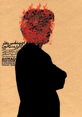
Since my travels to Damascus last year I have become very interested in Graphic Design and the development of Design in the Middle East. Alot of the design produced by Arabic speaking countries is based heavily around typogrpahy as Arabic is a beautiful language with alot of elegant contours that work well on posters.

I was delighted to find work from the East that I haven't seen before on Anna Stratigaks' Blog today. The work of Reza Abedini is really interesting becuase it combines arabic typography with illustration to produce Graphic Art, this was something I have been experimenting with and my illustrtation for D&AD New Blood was probably the most successful example of this:
This was a combination of my father's Arabic (handwritten) and my illustration influenced by Middle Estern Photojournalism.

Below are some example's of Abedini's Graphic Art:


I love the juxtaposition of the elegant contours of the Arabic typography with the almost 'urban' imagery and English Caps.