
Sorry for the lack of posts this week, I am on placement at the moment but I will try my best to keep posting something.
Wednesday, 25 July 2007
Nike: Play Colourful! Viral Advert
This is a brilliant viral advert from Nike playing upon Japanese humour to create a bizarre yet captivating visual narrative. The viral involves a mob of what can only be described as ninjas / power ranger-like characters harassing Japanese business men. I feel this viral works because you only see the brand for a split second towards the end, if branding had been placed throughout the viral it would have looked too staged and fake whereas the final delivery has a gutsy edge to it. Enjoy!
Friday, 20 July 2007
Ironing Out the Creases
 I thought this was a great internet advert for Electolux Dryers that visually extends upon the function of the product. The web ad starts off completely crumpled but as your cursor rolls over the advert the creases get ironed out to reveal the full advert with copy that reads 'We were thinking why not let the dryer help with the ironing?'.
'Lucas With The Lid Off' - Lucas. Dir. Michel Gondry
This is possibly my favourite music video I have come across. It is, to me, one of Michel Gondry's best pieces of work. It involves a large studio set divided into several scenes. The main character, Lucas, performs whilst weaving through these scenes creating a continuous flow throughout the video. The best thing about this video is that it is one take, the movement from scene-to-scene and the placement of the camera, props and action has been timed to perfection by Gondry. The use of the camera to fool the audeince is used as well (for example, a 90 degree angle is used in the bed scene to fool the audience into thinking Lucas is lying horizontally, when the camera flips it is revealed that his legs were actually off the end of the bed - to make this more convincing even elements of the set were placed on their side).
Anyone interested in film or the production of music videos who hasn't seen this piece needs to watch it and appreciate the amount of thought that has gone into it.
Anyone interested in film or the production of music videos who hasn't seen this piece needs to watch it and appreciate the amount of thought that has gone into it.
Thursday, 19 July 2007
Magazine Spread - Personal Work
Below is some of my own personal work stemming from the icount illustration by James Joyce. This is an idea to create a magazine spread for my local area, the purpose being to infrom an audience of the developments in their locality without throwing stats at them. I have treid to create as much space as possible and really draw attention to the illustration which is very much part of the developments that will be raised in the spread (once it is complete!). Please let me know what you think...


Arabic Typography - Damascus, Syria
Below is a collection of images from my travels to Damascus, Syria. I have selected these images becuase they show the use of Arabic typography/ calligraphy in a real-life scenario working to inform as well as embellish. 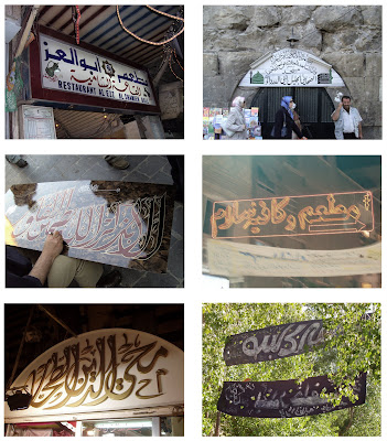 I found alot of similarities between Eastern and Western use of typography. Alot of typography was used to inform (this is logical as it is a simple method of communication). One thing I did find was tht calligraphy was alot more dominant in the Eastern culture, with traditional calligraphers selling their work on the street - each piece being a detailed visual presentation of the Arabic language. Shop Fronts seemed to use calligraphy in different ways; the amount that the signage was embellished or decorated seemed to be a good indicator of the stsus of the shop (with the more traditional and up-market shops selling cloth and antiques having extremely embellished shop signage). I also noticed that the more modern shops in the city centre were using LED lighting and neon instead of embellishment - the Arabic would be more minimal but woud be backlit to create a modern look.
I also found Hezbollah flags hanging from the ceiling of the market halls. The flag uses different variations of Arabic to create a striking visual. According to Wikipedia the bottom of the Flag reads, "The Islamic Resistance in Lebanon." The upper text reads,"Then surely the party of Allah are they that shall be triumphant." (Quran 5:56) The main part of the Flag is the Hezbollah logo which is a representation of the phrase "Party of God" rendered inKufic script which I personally find the most bulky and masculine of all of the Arabic writing styles. The first letter of 'Allah' reaches up to grasp a rifle.
From a design point of view this logo communicates a very clear message even without having to understand the Arabic language, the use of the rifle and the clanched fist suggests violence, war and revolution. As stated earlier the Kufic script is also very masculine and has a very strong and confident 'tone-of-voice' which is also reflected in the boldness of colour and line.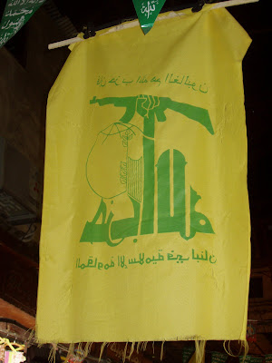
 I found alot of similarities between Eastern and Western use of typography. Alot of typography was used to inform (this is logical as it is a simple method of communication). One thing I did find was tht calligraphy was alot more dominant in the Eastern culture, with traditional calligraphers selling their work on the street - each piece being a detailed visual presentation of the Arabic language. Shop Fronts seemed to use calligraphy in different ways; the amount that the signage was embellished or decorated seemed to be a good indicator of the stsus of the shop (with the more traditional and up-market shops selling cloth and antiques having extremely embellished shop signage). I also noticed that the more modern shops in the city centre were using LED lighting and neon instead of embellishment - the Arabic would be more minimal but woud be backlit to create a modern look.
I also found Hezbollah flags hanging from the ceiling of the market halls. The flag uses different variations of Arabic to create a striking visual. According to Wikipedia the bottom of the Flag reads, "The Islamic Resistance in Lebanon." The upper text reads,"Then surely the party of Allah are they that shall be triumphant." (Quran 5:56) The main part of the Flag is the Hezbollah logo which is a representation of the phrase "Party of God" rendered inKufic script which I personally find the most bulky and masculine of all of the Arabic writing styles. The first letter of 'Allah' reaches up to grasp a rifle.
From a design point of view this logo communicates a very clear message even without having to understand the Arabic language, the use of the rifle and the clanched fist suggests violence, war and revolution. As stated earlier the Kufic script is also very masculine and has a very strong and confident 'tone-of-voice' which is also reflected in the boldness of colour and line.

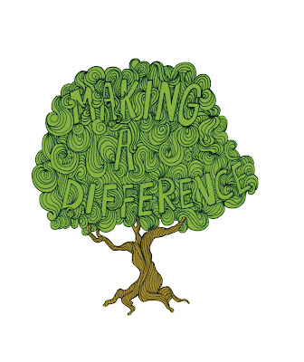
My response to James Joyce Illustration
Below is my own illustration work loosely influenced by the work of James Joyce. The message 'making a difference' within the tree is refering to a recent tree-planting initiative set-up in my local area by the City council and I wanted to try and raise the profile of the event with the illustration.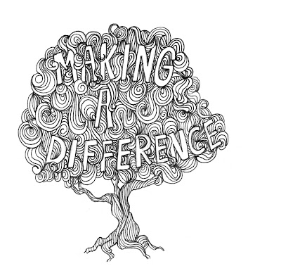 I have also tried the same image with colour, please let me know what you think.
 I have also tried the same image with colour, please let me know what you think.
Subscribe to:
Posts (Atom)