Saturday, 6 October 2007

One week Brief - Celebrate the Invisible (Brain waves)


An awkward meeting after a bad first date

My response to the brief is a short film experimenting with visual representation of thought processes. The subject of the film is a conversation between two people with a previous history that affects the way they now perceive each other on a conscious level. The style of the film is influenced by my research into the work of Michel Gondry and music video director Ace Norton. The visual representation of thoughts reveal the characters’ true emotions through words, colour and symbols. One of the most easily recognizable symbols of thought is the ‘thought bubble’ made popular by the representation of interior monologues in comic book artwork. For this reason, I developed a visual style heavily relying on the depiction of the monologue rather than the commonly used voice-over. I elected not to focus on the dialogue between characters in order to emphasize the things that would not usually be seen in film-based media.

The advantage of focusing on thoughts over words is that the narrative is not hidebound by the social niceties of day-to-day interactions. The characters are free to express their real feelings and motivations and in turn the audience is liberated to comprehend the realities of complex social situations. In addition, an interaction which would have otherwise been mundane becomes visually stimulating as the invisible becomes visible.

Finally, I have tried to push the concept of visual thoughts further to suggest that if thoughts can somehow leave the safety of the thought bubble they then become a physical entity, now visible to the characters, which in turn demands action.

Please let me know what you think of the work...

Sony Bravia Advert

A really nice addition to the 'colour like no other campaign'. This ad uses stop-motion to stunning effect. Enjoy!

Sunday, 2 September 2007

Pizza Express Menu


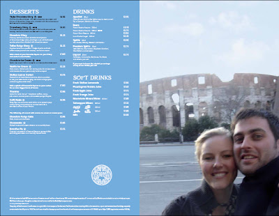
I went to Pizza Express this evening and was presented with the 'new look' menus. Initially all I saw was a blurry image of a couple on the front of a menu, no logo and the digital information of the photograph running down the side of the image. I was completley thrown, Pizza Express usually has highly illustrated covers to their menu and to be confronted with a holiday snap seemed to be completely unsuitable. However, I was wrong. When you open the menu the first thing you see is...


For me this blurb tied everything together and justified the holiday snapshot style of the front cover. The blurb reads '...Not the Rome from postcards, but the real Rome.' In context this suggests that the new pizzas and the new menu reflect a true glimpse of rome and doesn't sugarcoat or touch-up real life.

This is a really bold design and although I initially hated the fuzzy and cheesy images they really strengthen the concept. My only issue with some of the imagery is that while some look genuine, others look blatantly staged (which completley goes against the idea of reflecting the real Rome). Other than that this is a really strong concept.

Saturday, 1 September 2007

Lyricist Lounge feat. Nate Dogg, Mos Def & Pharoahe Monch - 'Oh No'

This music video is another example of type in motion but this time with the visual aid of the people saying the words. The typography is bold and often becomes a self-contained image or a snapshot within the video. The more successful and subtle use of film and typography in this music video is where the hip-hop artists rap into the camera and the lyrics flicker around them (often overlayed and possessing keyframed opacity to suggest movement in time - e.g. when something is said it is highy visible but as time progressess its presence fades).

The way in which the artists rap has also been taken into consideration, each rapper has a unique lyrical style - e.g. Pharoahe Monch is very intense to the point of shouting so the typography used to reflect his voice is bold visually and resonates on the screen whereas Mos Def speaks softer so the type glows and flickers.

BBC Radio Scotland: Tartan Toyboys (1995)


I found this short motion piece using typographic imagery influenced by a radio conversation soundbites after looking at Callum Barker's Blog on Type in Motion. The motion piece was developed by Barnbook and can be fond on their website. The theme of the convesation is about male strippers (women talking about a strip show they are going to watch called The Tartan Toyboys). The visual style is heavily influenced by postitute cards found in telephone booths. The animation is cut to the conversation and is a collection of stills with elements of the conversation appearing in the chosen type styles creating a punchy aesthetic as well as suggesting an almost 'found' look to the images - taking typography out of context to link in with the soundtrack.

Seasick Steve

One of the many musicians who played the Carling Leeds Festival but the most interesting one of them all. Seasick Steve is a Delta Bluesman who can really captivate an audience. His use of narrative story-telling is reminiscent of folk music but reflects on the hardships and woe of his life before he was discovered.

With the Mississippi Drum Machine; A small wooden box that is stamped to provide percussion, Seasick Steve creates a constant beat that is simple but catchy. His main guitar is called 'The Three Stringed Trance Wonder'. This is a normal guitar, but with only three strings. At the gig, he told the audience the story of how he got the guitar and that he bought it for $75 in this condition in Mississippi from a man named Sherman, who later told him he only paid $25 for it the day before. Steve vowed never to add another string, and that he would tour the world telling his story of how Sherman ripped him off.
After unfolding the origins of his number one guitar he goes onto claim that it is the "...biggest piece of shit in the world!".

From a design point of view Seasick Steve provides a snapshot of Mississippi culture and the Detla Blues scene that has been lost alot in modern day music. His live performance works so well because it is honest and intimate. His style of playing seems to be more about communicating emotion and wisdom from his life experiences.

Thursday, 23 August 2007

I'm off...again!

I'm off to Leeds Festival so sorry in advance for the lack of blogs this weekend...

Sunday, 19 August 2007

Philips RobotSkin TV commercial

I don't really like razor commercials but this one seems to be breaking some of the boundaries set by its predecessors. Rather than having the female draped over a well built male this advert shows a much more intimate relationship with the feminine aspect actually being a robot (suggesting machinery and masculinity).

With imagery very similar to Bjork and Chris Cunningham's work this advert takes a refreshing break from conventional razor commercials.

The Saga of Noggin The Nog: Tales of the Northlands

I remember watching this as a kid on VHS and loving the simple two dimensional animation, illustrated stills and the total dependence on narration to deliver each episode. I really admired the beautiful drawings and the sketchy stop motion animation that brought the stills to life. Enjoy!

HBO Voyeur


US cable network Home Box Office have recently launched an ambitous interactive video-based website. The concept was a multimedia experience that gives you a peek into what happens behind the countless windows we pass everyday.

The set up of the website is a single camera angle facing the front of an apartment block. Your cursor allows you to click on one of the eight rooms which will take away the walls of the apartment to reveal a cross-section of the building and the action taking place inside. The idea is that the story lines are simply action (no dialogue) but leave the audience wanting to know more. It is also possible to show all the video story lines at once as shown in the video below:


The site itself is a really good example of how video footage is becoming the next stage in website design and also shows how an audience can interact with a video website. It is also an interesting way of gaining a wider audience and providing a whole new slant on 'watching' something but at the same time is a little too perverse for my liking. The story lines do, however, make an interesting point about the fact that when people think no one is looking they are capable of things that are socially unexceptable, dark and impulsive. Please let me know what you think of this site.

Half Nelson (Film)


This was a fantastic independent film that I recommend any film-lover to watch. What really interested me about this film was the way it was shot; in an improvisational, documentary manner. Andrij Parekh shot the film almost entirely handheld (Parekh argues that the look is honest, naturalistic and straightforward). Many scenes were shot with the lens wide open and no filtration. The film seemed alot more focused on the performance of the actors and the handheld feel helped provide a much more basic and stipped down version of a movie in sharp contrast to mainstream film.

There were alot of simple light techniques used on-set to create a humble setting. In some scenes Parekh used just one light, a 1.2KW HMI directed through a window covered in tracing paper (1000H). The actual motel room curtains were used to cut and shape the light, making the whole room glow.

"It's important to me that the actors can inhabit a space without being blinded by lights on the set," he says. "It's something I learned from working with John Thomas and Harris Savides, ASC, as an apprentice. Light the room, not the faces. It was a great piece of advice."

I really loved some of the focus work on this film as well, there were some extreme close-up shots that made it almost difficult to follow thw action of the scene but made you really focus on the emotions being portrayed and the dialogue used.

Further information on the filming of Half Nelson available at www.kodak.com

Saturday, 18 August 2007

The Young Knives Album Cover

I was in a music shop the other day and I saw the album cover for The Young Knives cd. I am not really sure what to make of it really. I like the way the image depicts a typically british street and then a comical composition of characters related to the album title. The image reflects the music of the band quite well but theen the typography is a little confusing. By itelf the curved typogrpahy and left-alignment is aesthetically appealing but to me it doesn't relate at all to the rawness of the band's music which has been desribed as having comic lyrics, brash punk with a self-effacing, British melancholy. It seems a shame becuase as separate entities the visual components are great but as an album cover it doesn't truely represent the type of music the band make. On the other hand, it could be argued that the typography compliments the image because of its contrasting style. However, I am not yet convinced.

Alberto Seveso


After looking at the work of Neil Deurden I found a Blog of Michelle Almond's about Alberto Seveso's work. It is really similar to Deurden's illustrative work but takes it one step further by allowing the illustration to flow and dictate what parts of the female figure are revealed and what parts are left forthe imagination to 'draw'.

What I love about the above images is the way the illustrative shapes curve and mimic the shape of the human form and almost latch around the features of the model's face. The work creates a very delicate and femenine feel but at the same time images like the first one can still suggest a vibrance and playfulness which I admire and would lend itself well to animation.

The Future of Television


Is the Slingbox the future of TV? This box allows you to watch your home television on your computer or phone via a broadband internet connection meaning that which the right combination of software and hardware you could theoretically watch TV anywhere.


With regards to the future of television I feel that this device is just the first in many more developments to make television accessible. There have been suggestions that TV will eventually combine with the computer so that households wil have one homogenous unit. If this is the case the face of the internet will completely change and television will become alot more like the 'on demand' services around at the moment and even websites could become a full video experience.

Neil Duerden - Ingulf


Above are a collection of fashion pieces named 'Ingulf' by Neil Duerden combining photography and illustration. What I like about these images is that the illustration has been overlayed onto the skin of the model, her body becomes the canvas and the contours created by her body in turn define the shape of the illustration. This is in contrast to alot of design using photography and illustration where the photograph is left unchanged and the illustration either floats on top or in the background.

However, it would be nice to see how this image would look if the illustration were painted directly onto the skin becuase although the illustration has been carefully placed around the limbs and contours of the model I can't help but think it may be more successful to do it for real

Sky Movies Advert

I found this advert on the Creative Review Blog. It is an advert for Sky about the joy of not having adverts during their films. The advert was filmed in the city of São Paulo, which is currently banned billboard advertising after a “Clean City” directive from the city’s mayor, Gilberto Kassab, which banned all outdoor advertising, including shopfronts.

The resulting advert is a nicley filmed piece depicting the absense of advertising in the city. It isn't actually that wierd to comprehend the absense of billboard advertising because we live in an age now where we are bombarded with so much advertising that we almost ignore they are there anyway / show very little interest in the fact they are there.

Eco-Ego Website


Welcome to the world of eco-ego. This web-based game was produced for the purpose of having you learn "environmental protection that we can do immediately" while enjoying it. The natural environments change depending on our action. In the world where main character "Cocolon" lives, please experience that things. A point of the game is to keep the balance of "ecology" and "ego". You control the actions of the character via the orange panel at the top-right of the screen.

During your experience of the site Cocolon will need to eat, brush his teeth, go to the market etc. Every time you have a choice between an easy solution and the most ecological solution. For example, the screen-shot below shows how the audience is presented witht the task of separating the rubbish into the appropriate bins...

Also, the below screen-shot demonstrates how the environment surrounding Cocolon's home is affected by his actions. When the air-conditioning is on puffs of smoke appearfrom the factory chimney and all the birds and flowers die...


I think this is a really nice site that may be good for children to try and demonstrate that simple things like separating rubbish or cycling rather than getting in a car does make a difference. However, this site presents a problem for me. Although the intentions are honest its demonstration of environmental impact is exaggerated and doesn't take into account a sceptical older audience. On the other hand, this site shows how digital design can reach an audience in a new way rather than presenting them with the same old information (which alienates the audience).

Thursday, 16 August 2007

Life is a Laugh by Brian Griffiths


Above is an image of the latest installation for 'Platform for Art'; London Underground's public art programme designed to showcase and celebrate a rich and vibrant art scene.

"For this new sculptural installation Life Is a Laugh, commissioned by London Underground’s art programme Platform for Art, Brian Griffiths has constructed an epic 70-metre long site-specific artwork. Conscious of the transitional nature of both the site and its occupants the work taps into the character of this fleetingly captive audience, exaggerating a sense of expectation tinged with boredom, mental doodling and day-dreaming."

http://www.tfl.gov.uk/tfl/corporate/projectsandschemes/artmusicdesign/pfa/artists/lifeisalaugh.asp

The purpose of this piece seems to be to make the eye run along the vast span of the artwork and to have an almost abandoned feeling. It leaves you thinking 'what do these objects have in common?' or 'why is there a 7.5 m panda face in an underground tunnel?'

I think this is a fantastic installation by Brian Griffiths using unconventional objects for the surroundings and combining them to create something different and exciting. His installation wants to be a strucuture but it defies the basic principles of architecture. There is also alot of humour in his work which shows through and turns what is initially dead-space into a visual experience.

Justice - 'D.A.N.C.E' dir. Jonas & Francois

This is a really nice video coming of the back of the recent 'new rave' fashion trend. The video shows T-shirt graphics animated onto two models as they walk towards and away from the camera. I especially like the fact that some of the animation has been timed to make it look as if the models are interacting with the T-shirt designs. I also like the fact that the focus of the camera is on the torso of the model and completely crops out the head of the model (making you focus on the T-shirts before anything else).

Saturday, 11 August 2007

Chester Subway Murals


Recently there has been a movement in my hometown to improve city elements like subways and try and lift some of the current stigma associated with them. Above are four murals developed by volunteers with input from some of the churches in Chester. The murals represent different elements of Chester i.e. The Roman and Victorian influences as well as showing some of the famous architectural elements of Chester like the Eastgate Clock and the Fountains Roundabout.

I really like the idea of using design like this to brighten up the area and improve elements of the urban environment. My only concern is that although the murals look fantastic they aren't that big in real life and don't really cover up enough of the subway walls, if the murals stretched across a full wall I think they could create an even bigger impact than they do already.

However, these murals are a vast improvement to Chester's subways and it is refreshing to see artwork being put into use in an urban environment (this is not a new thing but seems to often be forgotten about).

Cicatriz Website


Here is another interesting concept for an online clothing site. Cicatriz.se has a fully intergated flash shop telling you what is in stock as well as showcasing the latest product range in a series of low-res videos set up in a grid (above).

Although the videos are low-res there are some really nice little features. For example, on the second video of the top row the model has been filmed pretending to pull the logo off of his T-shirt, a heavily pixelated version of the logo is tracked into the blank space. The end result is a blatent awareness that the visual is not meant to be taken seriously but instead shows the quirky nature of the brand as well as emphasising a selling point of the garment. Another nice feature is the planning of the website. The films fit into a timeline meaning that the play in an order, this allows for more visual tricks (i.e. creating the illusion that an item of clothing is being past between videos on two different rows by filming dropping a garment in one video and receiving the same garment from above in the other video).

Vision Streetwear Website


This is a good example of a full video website and how a apparel website can stay true to its essence. As the first page loads a pink spraypaint mark appears and drips down the page, straight away even this suggests the type of audience they are aiming for (young adults, rebellion, graffitti culture etc).


In addition to the loading percentage the website also provides you with a statement 'While you wait: 2 hectares of the worlds forests have disappeared,' however, the amount changes as the page loads and increases more and more. This is a simple idea but I really liked the delivery, it is the last place you would expect a message like that but it really works and will help to create awareness in a youngeraudience. Also, the delivery plays on the fact that you have to wait (converting the main weakness of the website into a feature), because the website is predominantly video it takes slightly longer to load - the 'while you wait' factoids are received by a captive audeince and use the amount of time a page takes to load to quantify another message.

Once the main website has loaded the entire background becomes a space for low-res videos to be streamed showing what the brand is about (skateboarding, music and the trends surrounding youth culture). The logo and navigation devices are static and in the foreground, made visible by spraypaint (also static). The entire website has a 'fanzine' influence and is an adaptation on the trend itself (derived from punk rock).


Another fantastic element of this website is the way the product is represented and really ties in the reason for having a video website. Instead of having a photo of the shoe they are selling or an expensive photoshoot with models posing Vision have instead used low-res videos close-ups of people's feet as they walk, run, and skateboard. This emphasises the brand and the fact they are more about the sport and lifestyle than other brands. They sell apparel for real people to be used in the real world. Personally I feel this is a really innovative way of showing a product and helps to strengthen the brand as well. Below are some examples of the the low-res videos of people wearing the product (the video still in the background).


Friday, 10 August 2007

A rhythm of lines (website)


www.rhythmoflines.co.uk

As part of the 'rhythm of line campaign for the Audi A5 design company GT have developed a website where you can draw your own lines and create your own car shapes and then view them from various angles:
"We ask the audience to create their own rhythm of lines."
This is another example of how digital technology has advanced to allow the audience to have a new way to interact with the brand.

The Flaming Lips (Live)


When I was posting my blog about Peter Gabriel's live show it reminded me of a live perfomance by The Flaming Lips at last year's 02 Wireless Festival. At the beginning of the set the front-man (Wayne Coyne) stepped into a gaint inflatable ball and rolled over the crowd. It was completely surreal but it fantastic! I thought it was a really good way to communicate the nature of the band as well as creating something memorable, a shared event that all the people who were there could say they witnessed.

Peter Gabriel - Secret World Tour (1994)


Peter Gabriel (ex-genesis member, WOMAD and Realworld founder) has always been well known for his innovative work. The Secret World Tour in 1994 showed how a live tour could be about the theatrical as well as the music to compliment the themes and emotions a song may be trying to get across. Gabriel worked with Robert LePage to create a visionary style of theatre to accompany personal songs focused on relationships.


LePage and Gabriel looked at polarities as well as relationships. For example, synthetic and natural, love and hate, male and female etc. The stages developed for the show emulated the male and female polarities to create the structure below (bird's eye view):
The female stage uses a circle and the male a more geometric rectangle. The props also emulated the polarities; Gabriel emerges from the male stage in a red telephone box (which is arguably a masculine structure constructed from geometric shapes) and later in the show a tree emerges from the female stage (representing nature, mother earth, and in sharp contrast to the man-made phone box). This is a really well thought through tour concept which really showed the possibilities of a live show and set movements for more recent shows like OVO: The Millenium Dome show which was written by Gabriel. The videos above and below are just a glimpse of the tour but I strongly recommend watching the 'Secret World Live' DVD and also his more recent 2003 'Growing Up Tour' DVD.

'A Scanner Darkly' - Author Philip K. Dick

This is a brilliant science-ficition novel that portrays an all-too-real drug culture in a futuristic society. The 1977 novel by Philip K. Dick joins protagonist Bob Arctor in the future (1994) living with a group of drug users. However, they are unaware of a parallel life that Bob is living as Agent Fred (an undercover police officer in charge of the surviellence of Arctor's house. A major part of the story is that all undercover narcotics agents must sheild their identity in order to avoid collusion or curruption. Arctor was only supposed to pose as a drug user but becomes addicted to Substance D (Slow Death or D) which is a powerful psychoactive drug.

In the book, extensive consumption of substance D causes the user's two hemispheres of the brain to function independently or "compete" resulting in hallucinations and a state of lucid dreaming. In the case of Arctor and Agent Fred it causes them to fail to see that they are the same person and Agent Fred begins to spy on Arctor. Throughout all of this Agent Fred is being put through a series of psychological tests which eventually reveal that he is no longer capable to do his job. Donna, Arctor's dealer and love interst, takes him to rehab (known in the book as "New-Path") where he is renamed Bruce and ultimately descovers the secret behind the emergence of Substance D.

The title of the book comes from a Bible passage in 1 Corinthians 13 which states:

" For now we see through a glass darkly, but then face to face: now I know in part; but then shall I know even as also I am known."

The main character of the book is required to view clips of his life on a 'scanner' (holographic recorder/projector used by the undercover police). In Chapter 13 of the book, the protagonist claimes that he has seen his life through the scanner but has come no closer to understanding it (similar to St. Paul in Corinthians) and that true understanding will only come in death. In other words, there are some things too big for one person to comprehend / there are things that we don't understand that will be revealed.

Although Dick's vision of the technology in the future was a little off the actual themes really struck a chord with me. Some of the key themes surrounded police surveillence and the blurring of a seedy drug culture with law enforcement agencies (which is also personified in the form of the character Bob Arctor). This duality seem
s to be underlying throughout the book but it could be argued that in today's society the blurring of boundaries is also a common theme. For example, in the case of surveillence where is the line drawn between lokking out of our best intersts and voyeurism?

What I also liked about this book is that although you are presented with a plausable protagonist there is no clear antagonist until late into the book.

I also watched the recent film adaptation of 'A Scanner Dar
kly' which I feel was a really underrated film. Directed by Richard Linklater, the film has been shot and cut like a normal film and than painfully rotoscoped to create an almost life-like animation.


The visual style for the film is spot on because it reinforces the idea of lucid dreaming or being in a state of consciousness when you are aware of what is going on around you but nothing seems real.
The Intro sequence to the film couldn't have been achieved in the same way with live footage. A Substance D user has developed paranoia and thinks he is covered in aphids but as he continuously washes they re-appear tormenting him. Please watch this film, if you are a designer or just a fan of Philip K. Dick it is worth a watch.

Battle for the Bronchs!


www.battleforthebronchs.com.au

This is a perfect example of how the digital side of design can be used in a new and interesting way, an interactive website utilizing video footage and flash gaming to create awareness about Asthma. Above is the teaser trailer for the website.


The main concept behind this website is a campaign by GlaxoSmithKline and Asthmascore to create awareness about the issues surrounding Asthma. Tequila (Australia) developed a video comic strip with characters such as Alvie Olie, Deep Bref and Hack Wheezer set in the fictional city 'The Bronchs'. The narrative involves the 'hero' Alvie Olie and his 'mentor'Deep Bref battling against the evil Hack Wheezer and his Trigger gang (The Trigger gang all have names of things that can set-off a person's Asthma). The purpose of this site is to reach young people who may be unaware of the symptoms of Asthma without boring them with facts and figures.

I really like the use of the comic strip format because it is naturally set out into scenes and has a narrative story throughout. This lends itself well to film; each box can have a different camera angle and show the perspective of the surrounding area in different ways. The actors have been filmed infront of a green screen and then still illustrations have been super-imposed as the background. The film sequences begin as stills (above) like a page from a comic strip but then each box will increase to full size (in turn) and play the section of film allocated to that box (as shown below). The end result is a flow of film in a narrative order as well as some secondary animation - sound effects and scaling as a visual aid. Although the narrative is weak and the characters not very interesting it still gets a definate message across and is alot more successful in delivering the message than a leaflet would be.


Also, the film/ comic strip is split into four main chapters, each one covering the idea of breathing and the need for air. Even the controls can be powered by the sound of your own breathing down a microphone. This enhances the level of interactivity with the story and allows the audience to engage with the concept on another level.

Wednesday, 25 July 2007

Apologies...

Sorry for the lack of posts this week, I am on placement at the moment but I will try my best to keep posting something.

Nike: Play Colourful! Viral Advert


This is a brilliant viral advert from Nike playing upon Japanese humour to create a bizarre yet captivating visual narrative. The viral involves a mob of what can only be described as ninjas / power ranger-like characters harassing Japanese business men. I feel this viral works because you only see the brand for a split second towards the end, if branding had been placed throughout the viral it would have looked too staged and fake whereas the final delivery has a gutsy edge to it. Enjoy!

Friday, 20 July 2007

Ironing Out the Creases

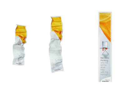
I thought this was a great internet advert for Electolux Dryers that visually extends upon the function of the product. The web ad starts off completely crumpled but as your cursor rolls over the advert the creases get ironed out to reveal the full advert with copy that reads 'We were thinking why not let the dryer help with the ironing?'.

'Lucas With The Lid Off' - Lucas. Dir. Michel Gondry

This is possibly my favourite music video I have come across. It is, to me, one of Michel Gondry's best pieces of work. It involves a large studio set divided into several scenes. The main character, Lucas, performs whilst weaving through these scenes creating a continuous flow throughout the video. The best thing about this video is that it is one take, the movement from scene-to-scene and the placement of the camera, props and action has been timed to perfection by Gondry. The use of the camera to fool the audeince is used as well (for example, a 90 degree angle is used in the bed scene to fool the audience into thinking Lucas is lying horizontally, when the camera flips it is revealed that his legs were actually off the end of the bed - to make this more convincing even elements of the set were placed on their side).

Anyone interested in film or the production of music videos who hasn't seen this piece needs to watch it and appreciate the amount of thought that has gone into it.

Thursday, 19 July 2007

Magazine Spread - Personal Work

Below is some of my own personal work stemming from the icount illustration by James Joyce. This is an idea to create a magazine spread for my local area, the purpose being to infrom an audience of the developments in their locality without throwing stats at them. I have treid to create as much space as possible and really draw attention to the illustration which is very much part of the developments that will be raised in the spread (once it is complete!). Please let me know what you think...


Arabic Typography - Damascus, Syria

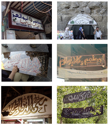
Below is a collection of images from my travels to Damascus, Syria. I have selected these images becuase they show the use of Arabic typography/ calligraphy in a real-life scenario working to inform as well as embellish. I found alot of similarities between Eastern and Western use of typography. Alot of typography was used to inform (this is logical as it is a simple method of communication). One thing I did find was tht calligraphy was alot more dominant in the Eastern culture, with traditional calligraphers selling their work on the street - each piece being a detailed visual presentation of the Arabic language. Shop Fronts seemed to use calligraphy in different ways; the amount that the signage was embellished or decorated seemed to be a good indicator of the stsus of the shop (with the more traditional and up-market shops selling cloth and antiques having extremely embellished shop signage). I also noticed that the more modern shops in the city centre were using LED lighting and neon instead of embellishment - the Arabic would be more minimal but woud be backlit to create a modern look.

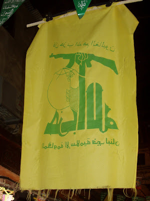
I also found Hezbollah flags hanging from the ceiling of the market halls. The flag uses different variations of Arabic to create a striking visual. According to Wikipedia the bottom of the Flag reads, "The Islamic Resistance in Lebanon." The upper text reads,"Then surely the party of Allah are they that shall be triumphant." (Quran 5:56) The main part of the Flag is the Hezbollah logo which is a representation of the phrase "Party of God" rendered inKufic script which I personally find the most bulky and masculine of all of the Arabic writing styles. The first letter of 'Allah' reaches up to grasp a rifle.

From a design point of view this logo communicates a very clear message even without having to understand the Arabic language, the use of the rifle and the clanched fist suggests violence, war and revolution. As stated earlier the Kufic script is also very masculine and has a very strong and confident 'tone-of-voice' which is also reflected in the boldness of colour and line.

My response to James Joyce Illustration

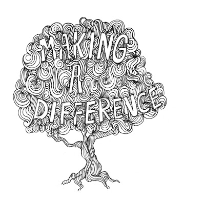
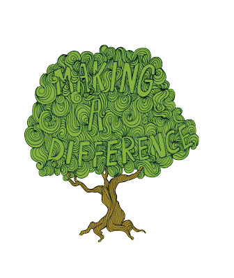
Below is my own illustration work loosely influenced by the work of James Joyce. The message 'making a difference' within the tree is refering to a recent tree-planting initiative set-up in my local area by the City council and I wanted to try and raise the profile of the event with the illustration.I have also tried the same image with colour, please let me know what you think.